Jul 30, 2025
As fast casual continues to grow in influence by bridging the gap between quick-service convenience and full-service atmosphere, design is playing an increasingly strategic role. It’s not just about where people eat, but how the space makes the customer feel, how it performs during peak flow and how it subtly reinforces brand purpose.
In our work at Chipman, we’ve partnered with forward-looking brands like Jeni's Splendid Ice Creams, Mendocino Farms, Cava and Noodles & Co. to create dining spaces that do more than look good: they work hard. So, what makes a fast casual restaurant truly well-designed?
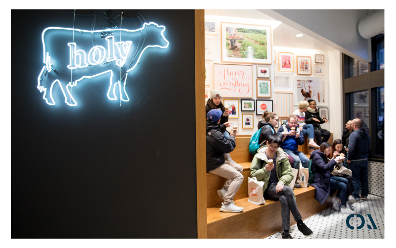
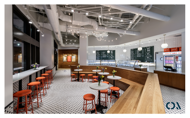
A well-designed fast casual space strikes a careful balance between brand expression, operational flow and guest comfort. At its core, the space should tell a compelling story without needing a wall of brand history signage. Jeni’s built from scratch ice cream recipes, Mendocino Farms’ fresh-from-the-farm feel, Cava’s breezy Mediterranean minimalism and Noodles & Company’s globally inspired comfort offer distinct narratives that come through in the lighting, materials and layout. Each environment invites guests to engage with the brand on a sensory level, making the experience feel intentional and authentic from start to finish.
But storytelling isn’t enough on its own! The layout must flex with the rhythm of the day: lunch rushes, digital orders and dine-in lingerers all need to coexist without friction. What sets fast casual apart from QSR is often its hyper-locality through community art, thoughtful seating zones or regional touches that make the space feel rooted and personal.
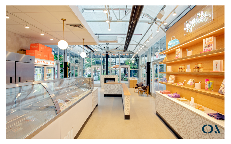
Brand integration is essential in fast casual design, but it should feel like a whisper, not a bullhorn. Overbranding (a.k.a. where every surface screams for attention) can undermine authenticity. The most successful designs invite guests into a narrative using lighting, materiality and spatial rhythm, rather than lecturing them with logos and taglines.
Color is a powerful part of this conversation. Brand hues should be used strategically as accents, not a flood. We find that incorporating brand colors in transitional zones like entryways, counters or pickup areas creates strong visual memory without over-commercializing the space. It’s about consistency with nuance to subtly connect with the brand.
With mobile and digital ordering on the rise, the pickup counter is a design imperative. Yet, too often, it’s added as an after thought. A great pickup area is clear, accessible and fully integrated into the guest journey. At Chipman, we recommend locating it near the entrance for ease, but with just enough separation to avoid congestion. Digital signage, branded shelving and intuitive wayfinding will all contribute to a seamless experience. And even though it’s a quick-turn zone, it should still feel like the brand, never sterile or transactional!
Where we see fast casual concepts falter is often in the misalignment between concept and experience. Poor queuing design, inadequate signage and acoustic or lighting issues all erode what should be a premium-feeling environment. Inconsistent guest flow frustrates both staff and customers, especially at peak times or when juggling third-party delivery platforms. The result? A space that feels chaotic, rather than intentional and innate.
Ultimately, a well-designed fast casual restaurant is more than the sum of its finishes. It’s a space that adapts to its guests, tells a story with clarity and supports the brand from the inside out. It’s hospitality, built to scale.


